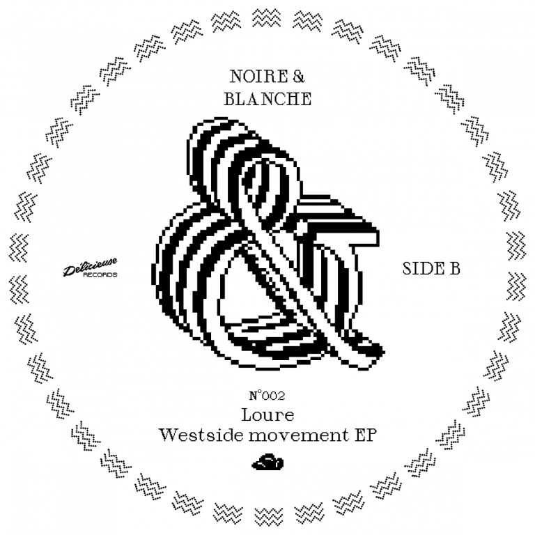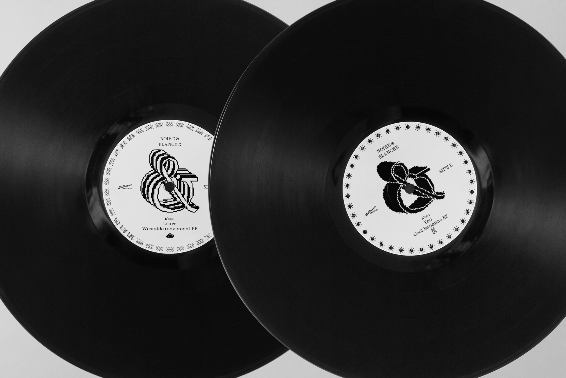
Noire & Blanche
Noire & Blanche is a house music label
from Bordeaux, France. They needed to
freshen up a bit their designs.
For this Identity I wanted to go back
in time, revisit my first encounter
with Graphic Design: CD-Roms.
So much that I became interested
by publishing softwares from the 80's.
I found the program that has drastically
changed the whole amateur scene,
from Birthday Parties card, to
garage sale: "Broderbund : The Print Shop".
This also serves as my graduation project


I figured out that this "amateur" feel that
we had from this aesthetic was what we felt
through the beginning of house music.
Bed-room studios, a love for old sounds,
samples and machines, the way these tracks are
formated by the gear they used. Tempo,
synths, etc. It was like they were all
building from the same template.
I needed to take inspiration from these
abandonware, sometimes even use some
to get where I wanted.
Looking through the user's guides,
I could define what I really
needed to create.
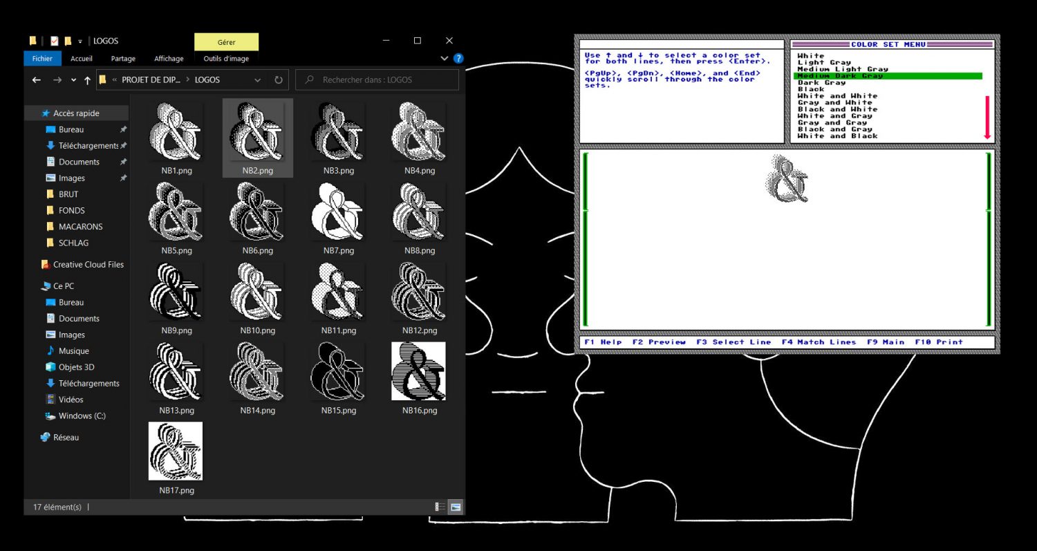
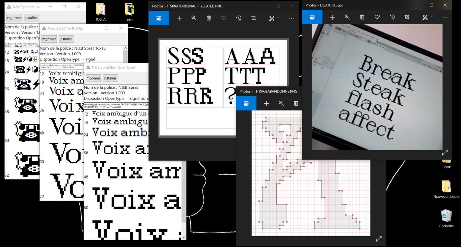
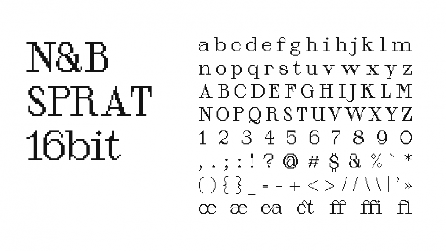
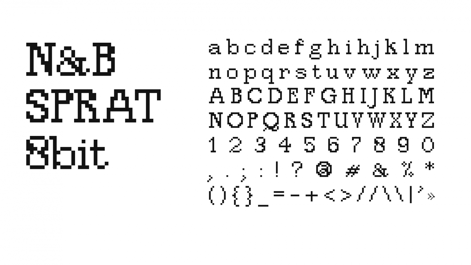
Starting with typography,
Loads of fonts were pixelated versions
of already known typefaces,
so I decided to get my hands on
the Sprat by collectivo
(which is heavily inspired by 80's font)
and pixelated it by hand, using
a 16bit and 8bit grid.
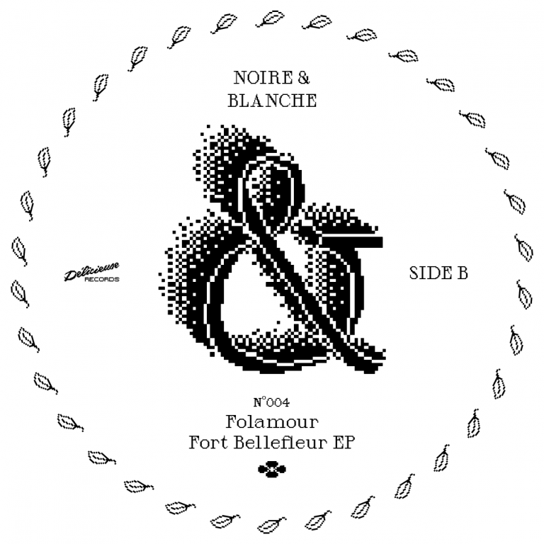
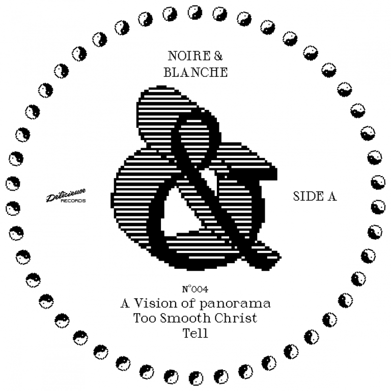
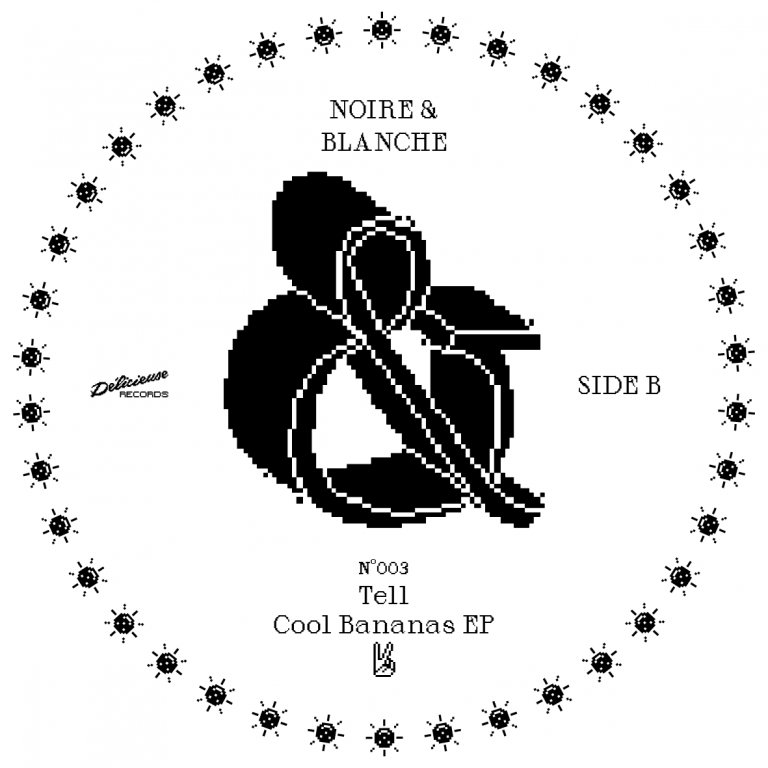
Next up, I wanted to keep the strength
the borders gave to these compositions,
but had to deal with a circular format.
That's when I decided to borrow from
Wingdings, Dingbats, Susan Kare's
icons and primitive emojis.

The logo came naturally while
having fun with WordArt's ancestor:
Banner Mania, resulting into
17 variations of the same logo.