
Thomas Suadicani
Pantotype


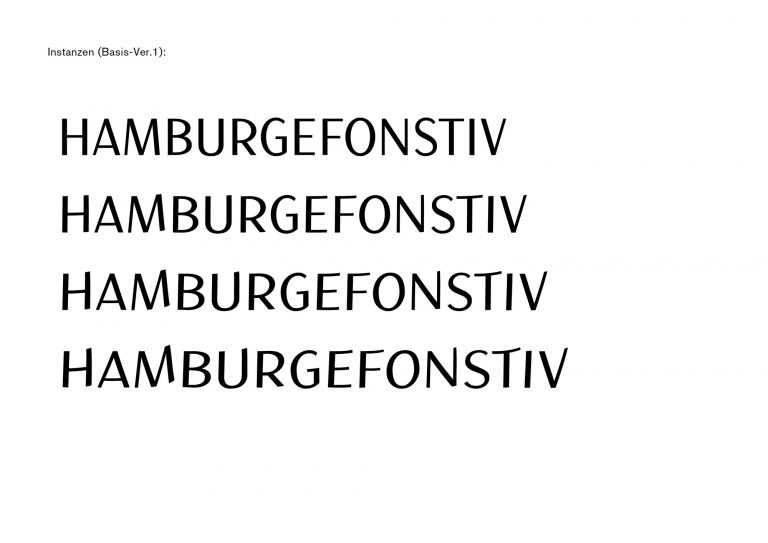

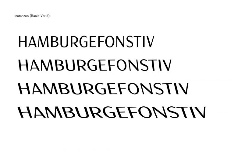
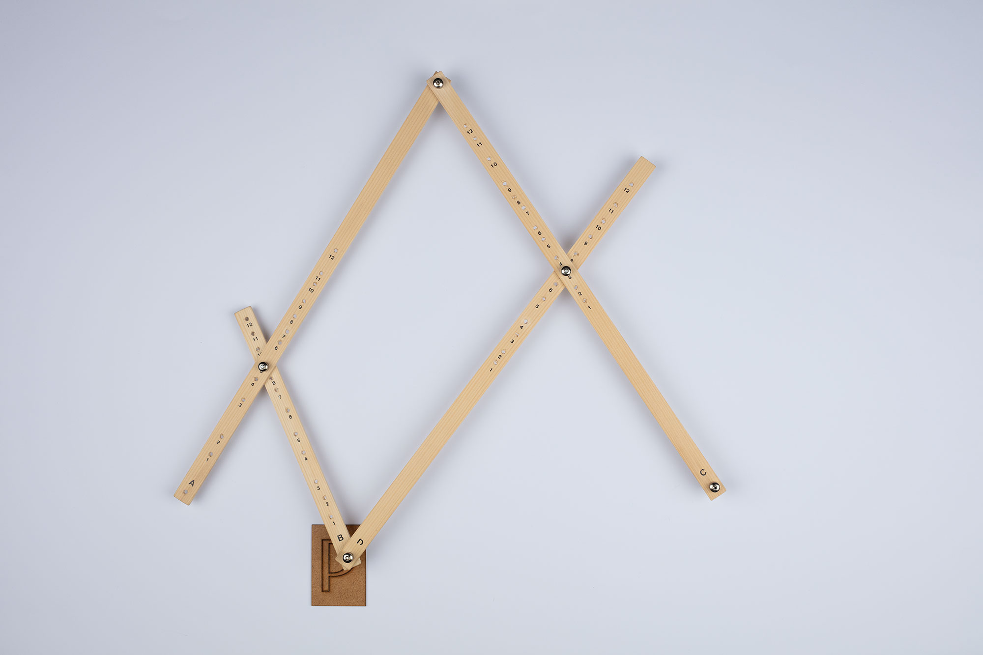
Distortion of a font through a random process. The basic idea of my work was to create a typeface in which the designer has no influence on the final shape of the glyphs. The random process is supposed to generate the shapes itself. The tool I chose to visualize and execute the random process was the pantograph, a tool that played a big role in the history of typography. With the invention of the Benton Pantograph in 1884, it was possible to scale, compress, expand and tend the glyphs directly on the matrix of the metal type. The name Pantotype is composed by the words Panto (representating the pantograph) and Type (representating the result of the random process).
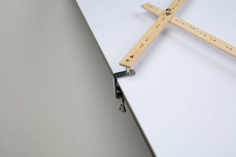
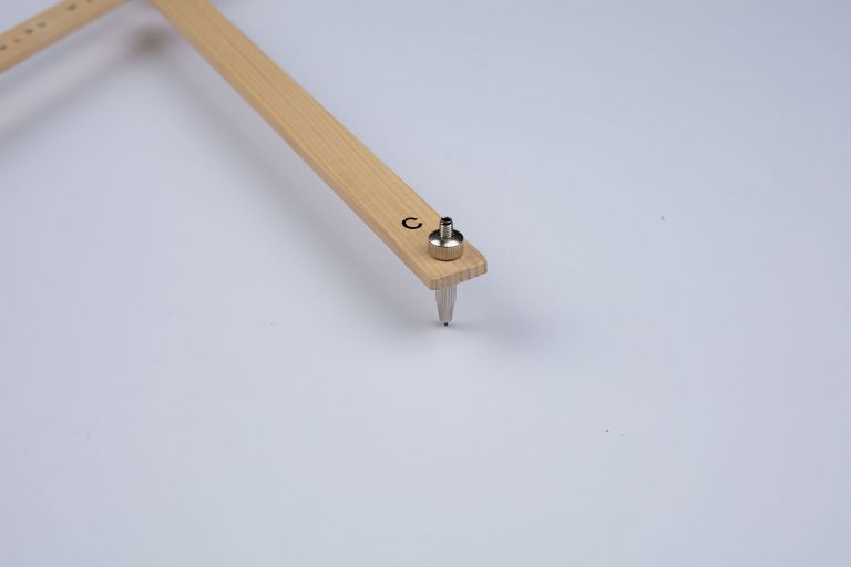
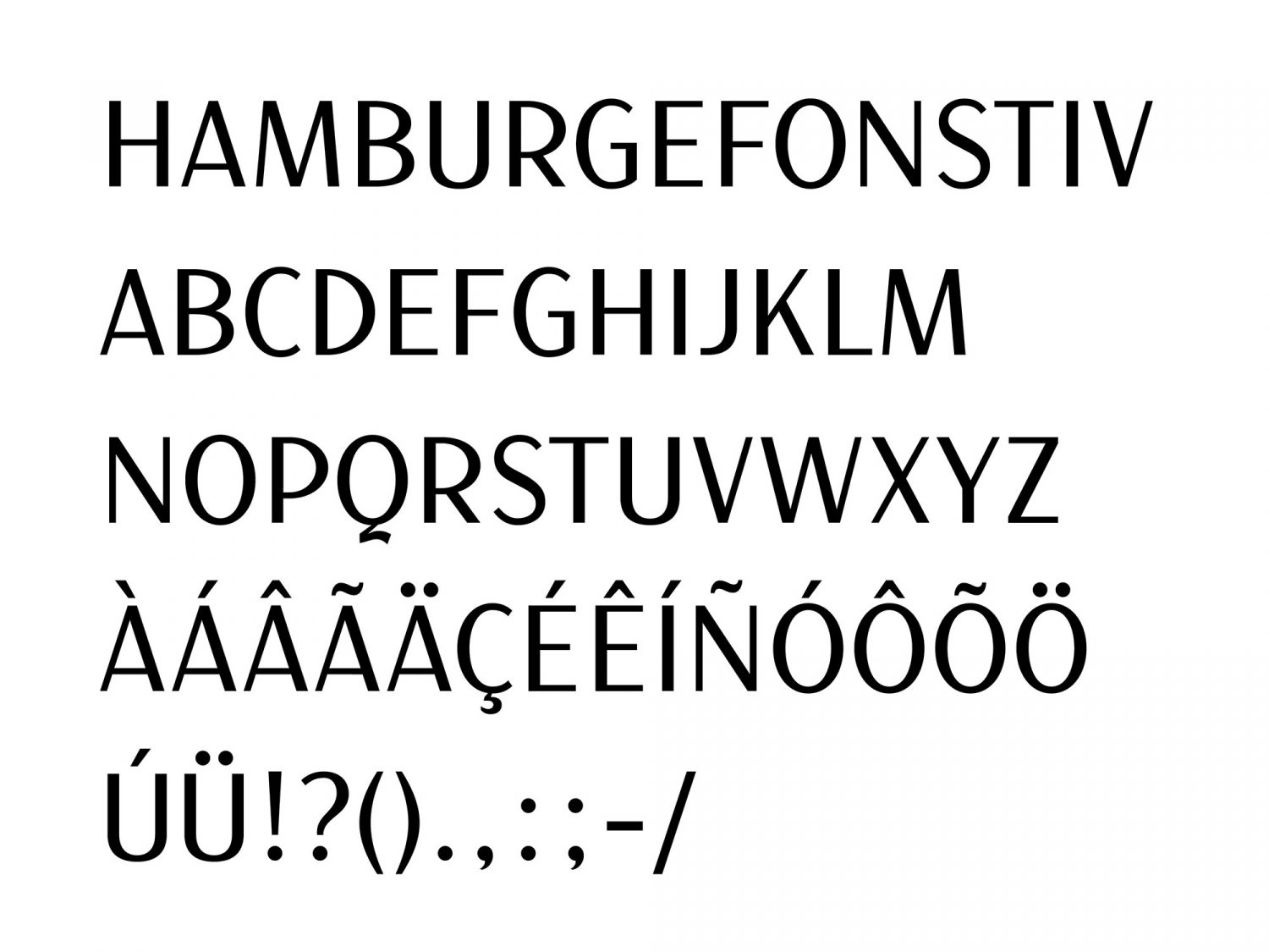
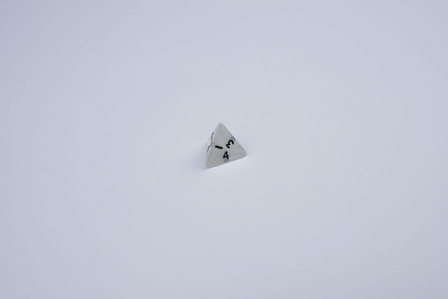
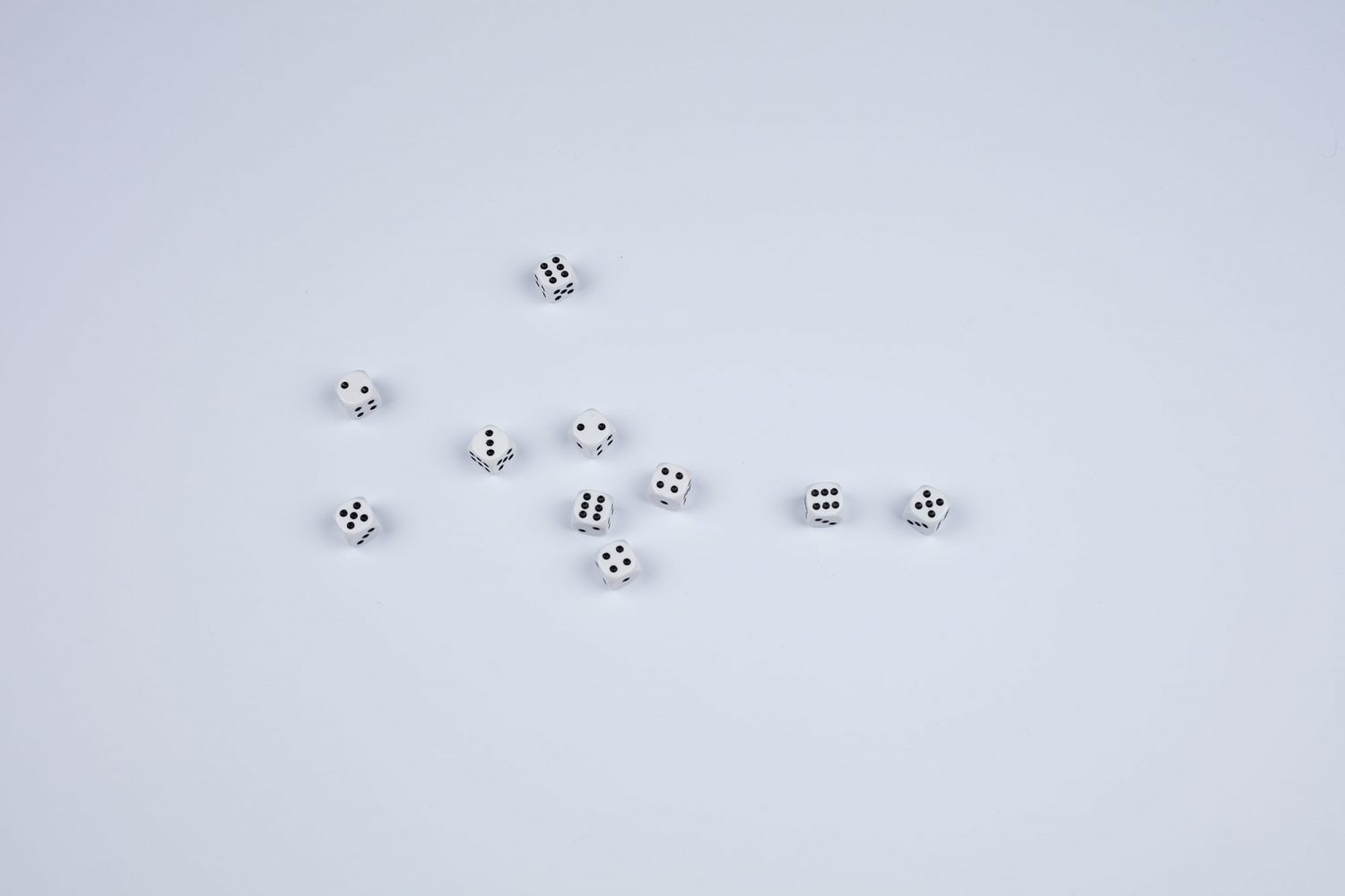
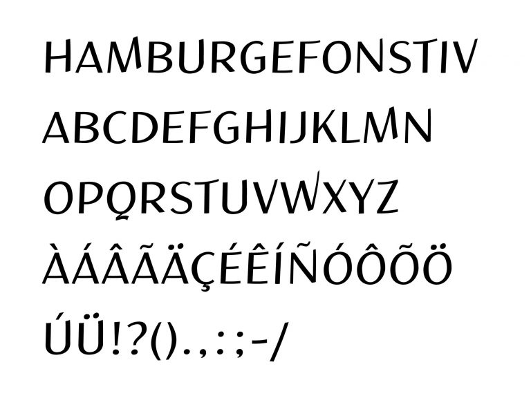
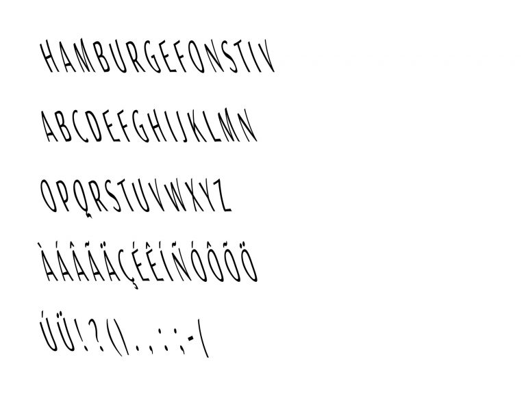
First, I designed a font that served as the basis for the distortions. It is an all caps sans-serif, with a light contrast. The basis font was intentionally designed characterless, so that it could gain personality through the random process. In order to remain true to the original shapes of the glyphs during the random process, I built wooden matrices from the basic font. The matrices were also inspired by the techniques used in the type casting in the past. The first step of the process was to define the positions of the pantograph and the units of each axis for the respective distortions. I determined the position of the pantograph using four-sided dice. The units of the four axes (A,B,C,D) were also determined by dice rolls. Two six-sided dice were thrown for each axis. The result of the sum of the two dice corresponds to the hole in which the axis was to be adjusted. I have performed the process of rolling the dice three times, one for each distortion/font style. After the settings of the pantograph were defined, I started the distortion process. For this, I attached the adjusted pantograph on the table and drew the distorted letterforms on an A3 sheet. For every distortion/font style, I distorted each glyph manually. The drawn results were then scanned and vectorized on the Glyphs app. I then converted the font family Pantotype into a variable font. The basic font and the three distortions served as the masters of the font family. By interpolating between the masters, it was possible to expand the results of the random process digitally. Instances were generated between the different font styles.
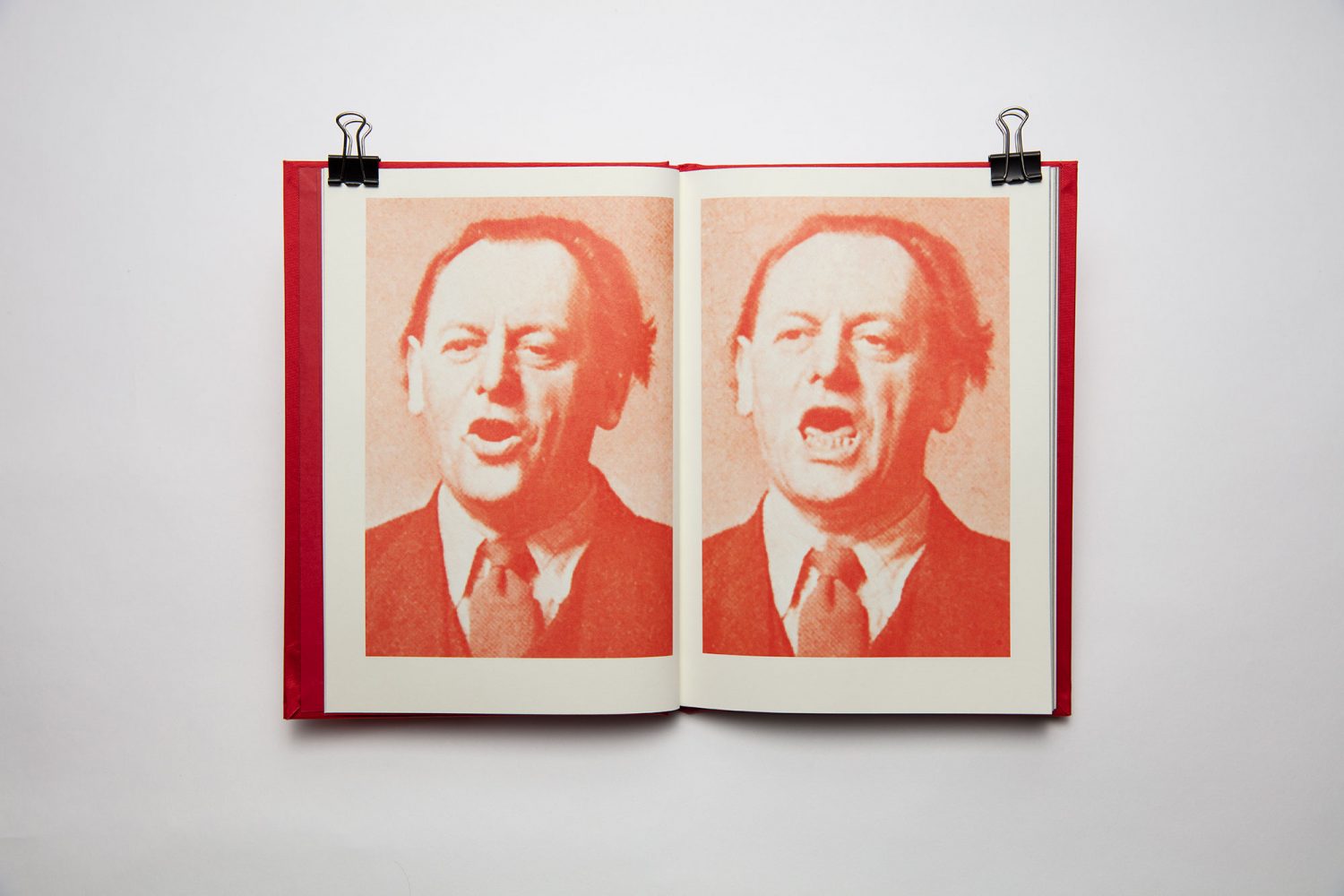
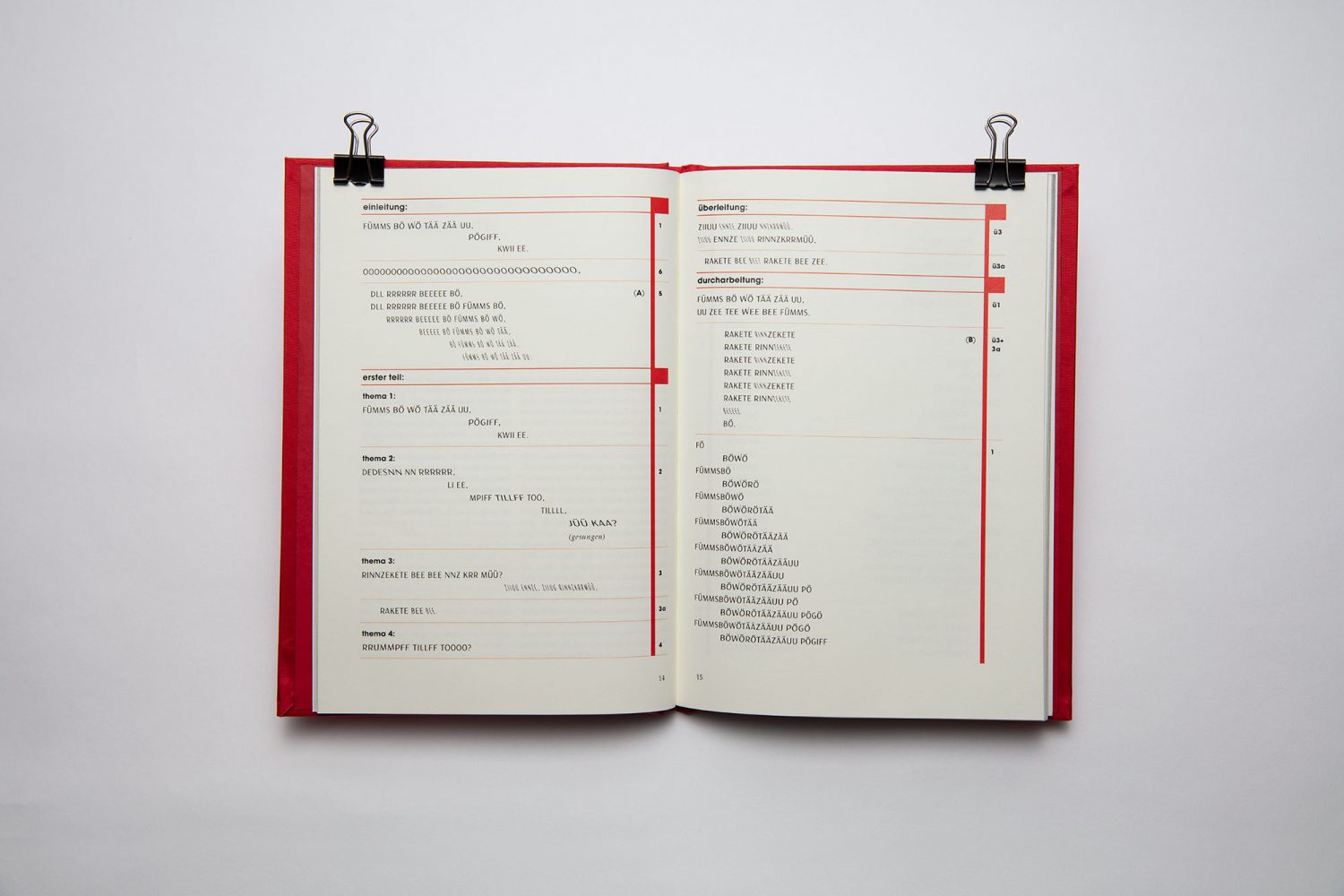
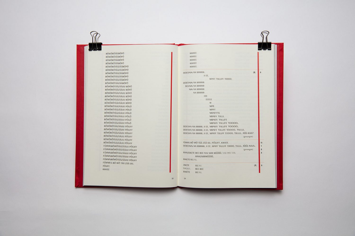
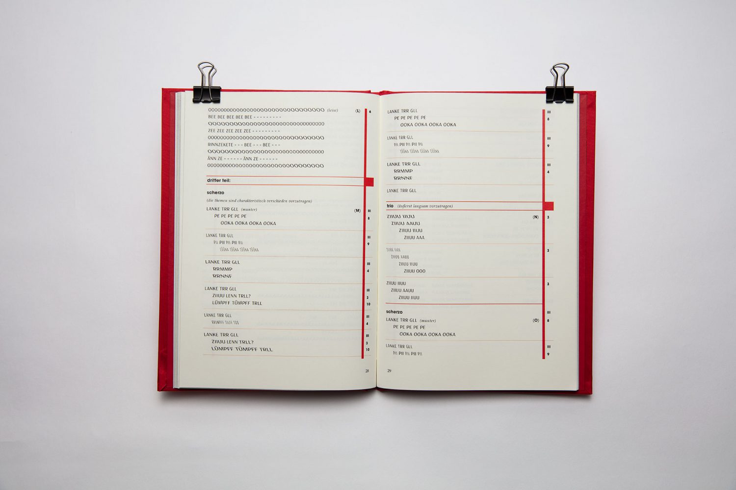
Finally, I wanted to see the Pantotype in use so I chose the Ursonate by Kurt Schwitters to reproduce it with my typeface. I chose it because it has a connection with the aspects of randomness and experimentalism – as does the whole dadaist artistic movement. The Ursonate is a sound poem composed and written between 1923 and 1932 by Schwitters. The original "score" of the sound poem, designed by the typographer Jan Tschichold, was published 1932 in the issue 24 of the Merz magazine. The parts in which the distortions are used should serve as visual and tonal means to the person that is reading/performing the sound poem, but are open to individual interpretations. When performing the poem, the distortions could correspond the change in e.g. tempo, pitch, emotion, intonation and rhythm. Through the visual variation of the typeface and its interpretation by the reader/performer, Pantotype adds a new stylistic meaning to the Ursonate.

